I don’t print very often, but when I do, I always end up telling myself that I should print more. So I treated myself to some gratuitously huge 45×30″ prints. For an idea of scale, the photos pictured are on a double bed, and are a little taller (in their shortest dimension) than our doors are wide.

Three 30x45" Prints

Photobox have fairly regular sales for credits for their various services. This is great, because it means you can cash in on the time-limited sales without having to commit to which images you want there and then. I bought the credits for these prints 3 months ago, with only a vague idea what I wanted to print.

I ended up printing the following three images:

I say I don’t print very often, and yet I probably print more than most people. I hire out the darkrooms at uni to print every couple of weeks during term time (although this is probably just as much to do with tricking myself into feeling like I haven’t yet graduated, if I’m honest), and we bought a small A4 inkjet printer a couple of months ago with the intention of printing 6x4s on a semi-regular basis, alongside the odd invoice or job application or whatever.

Without meaning to go into a philosophical photography-snob monologue, the way in which photographs are presented definitely affects your relationship with the image in a significant way. Spending four hours in a blacked-out colour darkroom to produce a single 10×8″ chromogenic print certainly gives you time to bond with the image. AirPrinting a 6×4 from your iPhone creates a completely different relationship – something more throwaway (we usually have a selection of increasingly tired-looking 6x4s scattered over our coffee table), but still something tangible that exists in physical space, that you can pick up and pass around and rearrange, and which can’t be dismissed by closing a browser window. But a 45×30″ print is something completely different, something that you don’t typically encounter outside of a formal gallery space.

Photobox currently have 40×30″ prints on sale at £12.49, down from £24.99, but only until Monday. If you buy photo credits rather than prints, you have 3 months to decide what you want to print. If you don’t have a Photobox account then contact me with your email address and I’ll send you a link which also provides you with 50 completely free 6×4 inch prints.

WordPress Logo

Today is the 10th birthday of WordPress, the platform that powers danfoy dot com, Creative Nottingham, and the majority of other web projects that I’ve worked on over the past 8 years.

WordPress began on 27 May 2003, as a fork of b2 (aka cafelog), and is now by far the most popular blogging platform in the world. It’s a mature and versatile platform, and has its own elegance, despite not being something that I’d describe as ‘lightweight’. ‘Blogging platform’ might be something of a misnomer – it’s grown massively in scale since I started using it around 2005, and can comfortably be used as a whole-site content management system (or CMS). It can be installed on any server that supports the requisite versions of PHP and MySQL. There is also a semi-free hosting service available at wordpress.com.

I’m currently redesigning danfoy.com using WordPress and an awesome adaptive framework called Skeleton. With a little forward planning, Skeleton makes it much easier to design websites which scale gracefully from full-screen web browsers, down to tablets (in portrait or landscape orientation), to mobile phones. It’s going to be awesome. We’ll soon be moving the Creative Nottingham site to a Skeleton-based WordPress site too, with help from Nottingham-based design agency Strafe Creative.

I take photographs all the time, but you wouldn’t know it from looking at this site. For the past 6 months or so I’ve been reserving the blog for more substantial, wordier posts, and I’ve been posing my images to Facebook, and occasionally to various accounts on sites such as Flickr and 500px, whilst the galleries on here become more and more outdated.

So, I spent the majority of yesterday coding a photoblog section for my site. I’m proud to say that I managed the whole thing without needing to resort to plugins, which may have broken compatibility down the line, and the process was useful upskilling for another attempt at fixing some long-standing backend issues on another blog that I’m a part of.

I’ll be posting a mixture of new and old material, at least initially, to build up the section. At the moment the posts themselves are formatted similarly to the normal blog, but I’ll be changing the images to appear larger by default on a future update.

Click here to visit the photoblog.

ePhotobook sleeve featuring Kat
Kat in our new home
Kat in our new home (in Nottingham, not Attenborough)

My partner Kat and I recently moved into our first non-student home together, in Nottingham.  I’m from Derby, which is a half hour drive away, and Kat is from Wellingborough, which is around an hour on the train.  Nottingham was an obvious choice for a couple of reasons: it’s the city in which we studied together, it’s a great city in its own right, and it’s also where the highest concentration of our friends live.

There are essentially two ways to surround yourselves with photographs in a new home: prints, and albums.  I love both, but they function very differently.

Prints Albums and books
  • Works best for single images, or in small groups
  • Always on show; becomes part of the room
  • Need to be matted and framed
  • Can be re-positioned, moved into other rooms etc.
  • Only works when you have lots of images
  • Great for curated sets, or telling stories
  • More portable than prints, and less likely to be damaged in transit
  • Not always on show; viewing images becomes more of an active decision

Photographs are important, and I like them to be printed large so that they become a dominating feature of the space.  The problem is that printing and framing large photographs can be prohibitively expensive, so care must be taken in deciding which photographs (out of literally thousands) to commit to printing.  In contrast, the main problem with photobooks is having enough images available to commit to the expense of printing and binding, without the images becoming incohesive.

Deciding on how to display photographs in our new home got me thinking about the benefits of presenting images in book format.  My favourite photobook is American Power by Mitch Epstein, which Kat – in a small, isolated example of what an amazing girlfriend she is – bought me for Valentines day last year.  American Power is 144 pages long, and requires a decent (but well-rewarded) investment in time to properly enjoy.  It is beautifully printed on thick paper stock, hardbound, and lovely.  It is expensive to print books like this, especially as a consumer and as a one-off.

It no longer has to be this way, however.  I use Adobe Lightroom to catalog and process my photographs, and version 4 of Lightroom introduced the ability to produce elegant photobooks for publishing either through Blurb’s printing service, or – significantly – as a PDF or series of JPEG files.  I decided to try this out by creating a short photobook based on yesterday’s trip to Attenborough Nature Reserve with Kat.  Think of this as a self-contained section in a family photo album.  The same principals should transfer nicely to short photographic projects.

Unfortunately the PDFs exported from Lightroom split each double page spread into separate pages.  To get around this, I exported the book as separate JPEG files, and then recreated the book in InDesign CS3.  The book I created, which is presented as double 10×8″ spreads, is embedded below.  However, I recommend you download a copy in PDF format, for better quality.

View this document on Scribd

Producing books in this way is quick and costs nothing, which means publishing photographic projects in book format no longer necessitates said projects being as epic a commitment as American Power.  Expect more eBook mini-projects in the near future.

I have a Moleskine notebook that I use for uni and the odd other occasions that I need to take notes.

I love my Moleskine. The pages are the perfect size and shape for how I use a notebook, and the pages are light, yet thick enough to stop ink bleeding through to the other side, and sufficiently textured to feel pleasing to write on.

The major drawback to a Moleskine is that it’s a physical, analogue medium, in a world in which I’m used to the conveniences of digital tools. The photos I take on my iPhone (which, I am only slightly surprised to admit, has become my most frequently-used camera) automatically appear on my MacBook Pro and iPad. Anything I need to remember or retain a record of goes straight into Evernote, which is not only synced between all my devices, but which are also run through Evernote’s free OCR service, meaning that even text within photographs I’ve taken is searchable. I’ll leave the triumph that is my (well, Peter Krogh’s) photograph-cataloging system for another post.

Last week I stumbled across Paper, which is an ostensibly free iPad app for notes and journaling. On the face of it, this should make it an excellent replacement for my Moleskines. However, it has a couple of drawbacks.

Firstly, the only tool available by default is a generic pen. There are a total of 5 tools available which, apart from the pen, cost either £1.49 each, or £5.49 for the lot. The free pen isn’t a terrible choice – I’d much rather have it than, say, watercolours – but it is incredibly hard to use without a stylus, which is the second major drawback. My writing isn’t massive and, to be honest, isn’t that terrible, but I find it hard to enter text by hand into this app.

‘Arty’ as it looks, it isn’t particularly functional for writing, which is what initially drew me to Paper. What it turns out to be very good for indeed, however, is quick sketches. For instance, even for someone who can’t draw, the following drawing only took me about two minutes, and zero effort:

Each drawing is saved automatically as a page, meaning that finding drawing and notes that you’ve made is a case of flipping through pages rather than scrolling through filenames. I’ve also found that it’s useful for drawing lighting diagrams:

I’ve also been using Paper to scribble diagrams of ideas for layouts for an upcoming group exhibition. It’s quite satisfying to use for this kind of note-taking because the book-like organisation system means that you’ve always got a record of notes that you’ve taken without having to manually save.

So, in conclusion, it’s a great app for scribbles and drawings. Not something that could replace a physical notebook, but an excellent compliment.


cinemagr.am of Kat

The App of the Week on the iOS App Store this week is Cinemagram, a tool for animating portions of otherwise static photographs.

The app works by capturing a couple of seconds of video and then allowing you to mask over the details that you’d like animated.  It’s surprisingly satisfying.

Cinemagraphs aren’t new (there are some nice examples on Jamie Beck’s tumblr photoblog), but I wasn’t aware of such a simple way of making them before now.

It’s a pretty straightforward process, with a couple of catches.  Firstly, everything needs to be pretty still, and the details that move should move in place rather than moving around the frame.  The second thing to be aware of is that in order to create a seamless animation, the movement is played forwards and then backwards on a loop.  This is quite evident on the example (of Kat in KFC earlier) above – notice how she sometimes blinks ‘backwards’.

At time of writing, it is free in the UK iOS App Store.

Francesca - Pianosequenza by Mario Zanaria

I recently came across the excellent Pianosequenza series by Mario Zanaria.  In this series, Zanaria uses a whole 36-exposure rolls of black and white 35mm film to create contact sheets, which become the final output.  There are a mixture of square-ish ones in rows of 6×6 frames (as above), and others that are laid out as 5×7 frame portraits (such as this excellent piece).  Be aware, though, that some contain nudity and therefore may be NSFW.

They’re absolutely fantastic, as is the rest of his work.  We’re all familiar with the maxim ‘there is nothing new in photography’, but having said that, I don’t recall any well-known examples of contact sheets being used in this way.  The nearest thing that I can think of is the Facebook profile banner manipulations that were fashionable for a while, before Facebook Timeline came out.  To compare Zanaria’s work to Facebook hacks would be insulting, though – to end up with results this perfect, with 36 perfect frames, on an analogue medium, is very impressive and visually arresting.

Zanaria also sells a set of photobooks on Blurb.

Via PetaPixel.

I recently encountered a problem whereby I became locked out of my own blog, where attempting to access the admin page for WordPress would redirect me to the page I came from.  Apparently this is quite a common (and infuriating) problem with WordPress blogs.  Considering this, I thought I would be able to find a solution a lot quicker than I did.

Most of the advice online falls into one of 2 categories:

  1. Login using [blogroot]/wp-login.php instead.  This is the easiest method to try, as it doesn’t involve changing anything.  Once you’re logged in, you should be able to access your wp-admin dashboard without any problems.  If this doesn’t work, then the next most popular piece of advice seems to be:
  2. Backup and then delete the .htaccess file from your blog root.  .htaccess files are the usual method for managing redirects within WordPress, so this advice makes sense.

It seems that a combination of these methods seems to resolve most peoples’ problems.  However, neither worked for me.

It turned out that the problems that I was having were related to a faulty plugin.  Without access to the dashboard I was unable to disable my plugins, so I had to disable them via FTP instead.  If neither of the above methods work for you, try this:

  1. Login to your website via ftp, and navigate to /wp-content/.
  2. Rename the /plugins/ folder to /plugins-backup/ or similar.  WordPress will be unable to detect them, and will deactivate them.
  3. Attempt to login to WordPress using your usual method.  If your problems were due to a faulty plugin, you should now be able to log in.
  4. Rename your /plugins-backup/ folder back to /plugins/.  Your plugins will remain deactivated on WordPress as a precaution.
  5. You can now reactivate your plugins on WordPress one by one to find out which was the culprit.

I wanted to share something I discovered at the end of last term – a service for Macs that creates a PDF booklet layout from any document. TL;DR:  That link is all you need to print booklets.

I don’t like making traditional ‘workbooks’ – you know, the ones where you document your progress, stick in your contact sheets and test prints, and talk about your influences.  Don’t get me wrong – I enjoy reading them, and they’re a good as a concept… it’s the execution that I have a problem with.  They’re supposed to show development and provide justification and influences for what you’ve done.  Which is great.

But it never seems to work out that way, and the act of creating the workbook seems to dominate the project – it becomes more about creating a workbook that’s very markable and grade-able, rather than creating a good body of work.  That has been my experience with them, anyway.  I’m sure that there are people that create workbooks as they go along, and use it as a documentary on the project rather than something that you do to jump through marksheet-criteria hoops.  Having said that, I know more people who simply fake their workbook at the end of the project, which IMHO misses the point.

Personally, I prefer to word-process an extended statement about the body of work that I’ve created, and then print it out as a booklet.  In the past I’ve then had these spiral bound at the print shop at uni.  For the sake of about £2, it’s a tidy way to provide some context for what you’ve been working on.  For my last project, however, I ran out of time and knew that I wouldn’t be able to get to the print shop before my crit.

This probably isn’t something that you’d know if you haven’t tried to print of a booklet using more than one sheet of A4 before, but it’s basically impossible to print out a multi-page booklet from whatever program you happen to be using.  AFAIK, it isn’t possible with Word, Pages, Publisher… whatever.  With this download, all you need to do is print out the PDF document that is outputted on a printer capable of printing double-sided, and staple it in the middle.  Simple.

It has taken me a loooong time to figure out how to do this, which is all the more embarrassing considering how simple ‘Create Booklet PDF Service’ makes it.  Anyone who read that rant has more than earnt the right to benefit from my struggles.

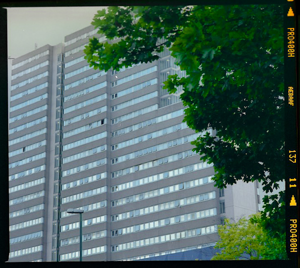
Victoria Centre flats, Nottingham

Project work has sort of taken a sideline to essay work recently, but with my essay now handed in I can spend the next (and final) week on my film project.  I was supposed to be out taking photos today, but thus far the skies have been really boring and I’m down to my last roll of film.  I’m waiting another hour or two and if the skies don’t clear up then I’m just going to have to do with overcastness and hope that the rest of my film arrives in the post tomorrow.

I’m still taking photos of residential towers, but I’ve found that using large format is prohibitively time consuming, not to mention slow, and time consuming.  And expensive.  I’ve found that it’s actually really nice to work with if you have plenty of time on your hands, so I’m going to try and persuade uni to let me take out an MPP over summer – you know, for if a situation arises in which I have loads of money and time.

Because of having to spend an awful lot of time on essays and stuff recently, I’ve been shooting a lot of medium format instead of large.  But I’m now out of medium format film, and I’ve been shooting a lot of stuff like this, which isn’t really relevant to my project:

Victoria Centre Flats, Nottingham…amongst other things, such as photos of Kat’s friend Kim eating, and Kat herself being very ill, neither of whom would appreciate having the photos stuck online.

…or maybe I will include it, I don’t know.  At least when I print it myself in the darkroom it won’t have those damn marks all over the sky.  Uni really should clean their scanners more often.